A Shopify product page has one job: help the right buyer feel confident enough to add to cart and continue to checkout.
Beautiful design helps, but conversion depends on clarity, proof, usability and trust.
Make the product clear quickly
The first screen should answer:
- What is it?
- Who is it for?
- What problem does it solve?
- Why is it worth the price?
- What should I do next?
Do not make shoppers dig for the main benefit.
Show the product properly
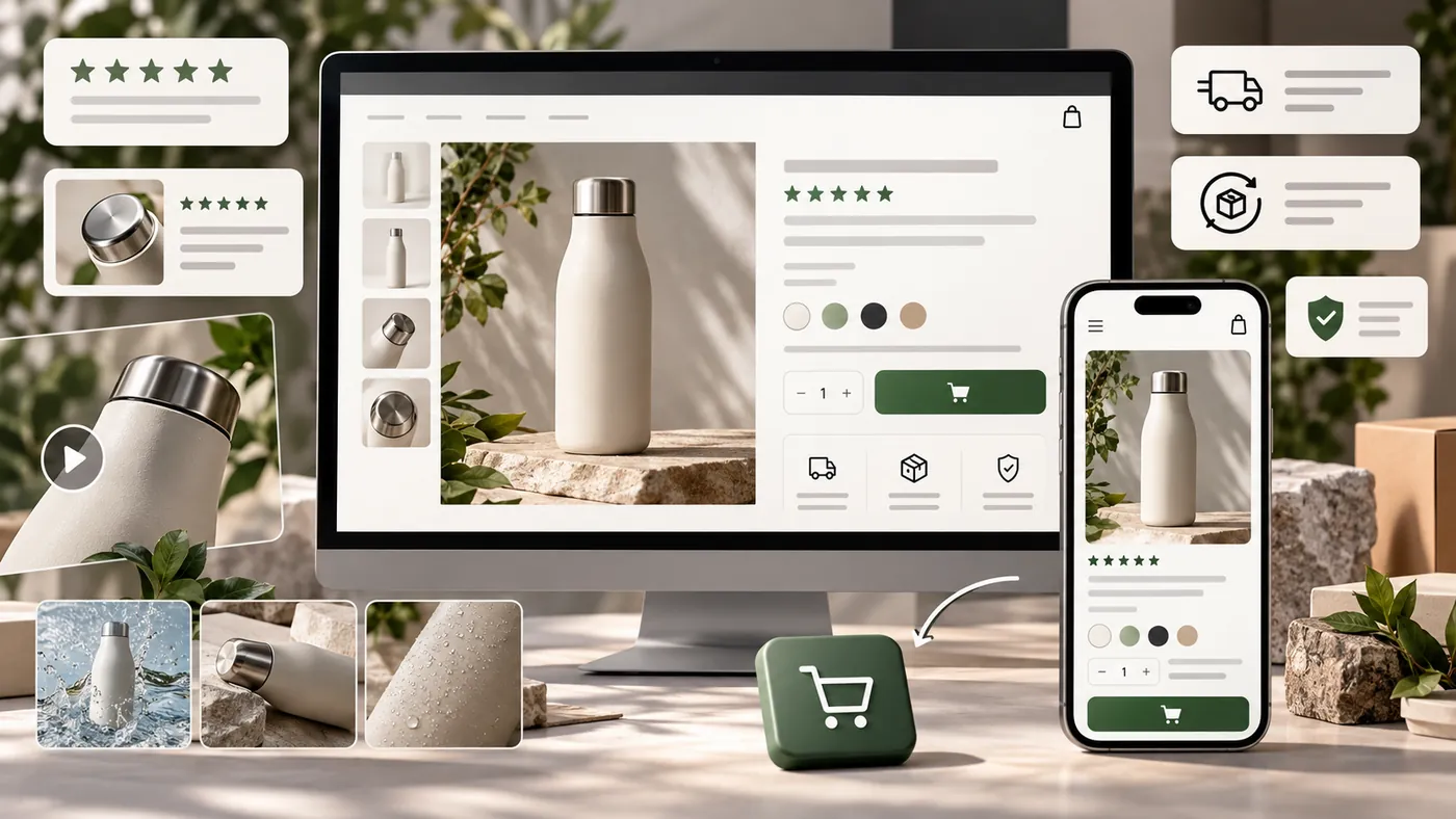
Use images and videos that help buyers understand the product.
Include:
- Clean product images
- Lifestyle images
- Detail shots
- Scale or size context
- Product-in-use visuals
- Short demonstration videos where helpful
For considered purchases, visuals reduce uncertainty.
If support keeps answering the same question, the product page should answer it.
Answer buyer objections
Product pages should handle common doubts before checkout.
Add clear information about:
- Shipping
- Returns
- Materials or ingredients
- Sizing
- Compatibility
- Warranty
- How to use it
- What is included
If support receives the same question often, the product page should probably answer it.
Use proof near the decision
Reviews, testimonials, user photos, press mentions and before-and-after examples help shoppers trust the purchase.
Place proof close to the areas where buyers decide: near the add-to-cart button, after benefit sections and around objection-heavy details.
Make the next step easy
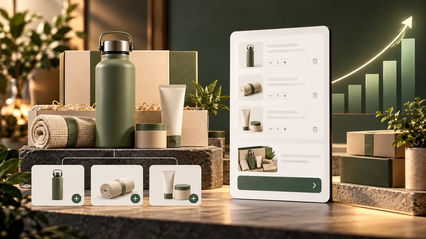
The add-to-cart button should be obvious on mobile and desktop. Product options should be simple to select. Pricing, bundles, subscriptions and shipping details should be clear.
Confusion lowers conversion.
The takeaway
Shopify product pages convert when they make the product easy to understand, easy to trust and easy to buy.